
How to Choose the Perfect Tie Dye Colors for Stunning Results
What if the secret to groundbreaking art isn’t talent—but fearless experimentation? I discovered this truth when diving into the vibrant world of fabric design, where blending unexpected hues transformed my projects from basic to breathtaking.
My journey began with simple patterns, but mixing shades like teal and yellow revealed endless possibilities. Liquid formulas, such as those from Dharma Trading Company, behave like paint—letting you layer tones for dynamic results. Testing combinations through swatches became my compass, helping me decode how pigments interact on fabric.

This guide isn’t just about technique. It’s about rewiring how you see creativity. You’ll learn to trust intuition, embrace happy accidents, and build confidence in your choices. Whether you’re new to crafting or refining your style, these insights will elevate your work.
Key Takeaways
- Experimentation unlocks unique artistic expression
- Liquid formulas offer precise control over blending
- Swatches prevent costly mistakes by previewing outcomes
- Trusted brands like Dharma provide reliable materials
- Color theory basics enhance pattern depth
Exploring the Basics of Tie Dye Colors
Every artist’s journey begins with a single step—mine started with a splash of fuchsia on white cloth. At first, choosing combinations felt overwhelming. But through trial and error, I discovered how primary pigments like turquoise and lemon yellow could birth entirely new shades when layered.
My Journey and Inspiration
My early attempts often produced muddy results. Then I learned a vital lesson: swatching saves time. By testing small fabric scraps first, I saw how fuchsia and turquoise create vibrant purple, while yellow and teal form lime green. These “happy accidents” became my signature style.
Understanding the Role of Fabric and Dye
Not all materials behave the same. After ruining a polyester blend shirt, I switched to 100% cotton—its fibers absorb liquid formulas evenly. As textile expert Lydia Smith notes:
“Natural fibers act like sponges, locking in brilliance.”
| Fabric Type | Dye Absorption | Best For | Brands |
|---|---|---|---|
| Cotton | High | Bold patterns | Dharma, Jacquard |
| Polyester | Low | Subtle effects | Rit Dyemore |
| Silk | Medium | Watercolor looks | Dupont |
For beginners, I recommend starting with pre-washed cotton shirts and Procion MX dyes. Follow the mixing order precisely—adding soda ash after applying pigments ensures lasting vibrancy. My first successful project paired coral and mint on a crewneck, proving simple palettes can shine.
Grasping Color Theory for Vibrant Creations
Have you ever wondered why some projects glow with energy while others look washed out? The answer lies in understanding how pigments interact. When I first tried combining fuchsia and turquoise, the result wasn’t just purple—it was electric.
Primary, Secondary, and Tertiary Colors Defined
Start with three essentials: red, blue, and yellow. These form every other hue when blended. Mix two primaries to get secondaries—like green from blue and yellow. Tertiaries emerge when combining a primary with its neighboring secondary, creating shades such as red-orange or blue-green.
In practice, lemon yellow and fuchsia produce vivid orange. Turquoise and fuchsia? A bold violet that makes shirts stand out. But stray too far from this logic, and you’ll face a common issue:
Choosing the Right Combinations to Avoid Brown
Mixing opposites on the color wheel (like red and green) often creates muddiness. Instead, stick to analogous hues—those next to each other. For example:
- Teal + cobalt blue = oceanic depth
- Magenta + violet = sunset gradients
I learned this after ruining a batch with conflicting pigments. Now, I use swatches to test pairs like emerald and lime before committing. As textile chemist Dr. Ellen Park states:
“Controlled blending prevents chemical clashes that dull brilliance.”
This approach transformed my work. A recent project mixing sapphire and mint stayed crisp because they’re analogous, while a risky coral-and-forest combo taught me to buffer with neutral white.
Mastering Tie Dye Colors: Techniques and Tips
Perfecting fabric art requires more than enthusiasm—it demands precision. After years of trial, I developed methods to control unpredictable results. Let’s explore three game-changing strategies that transformed my work from chaotic to calculated.
Creating Precise Color Swatches
I mix liquid formulas on 2″x2″ cotton scraps first. This reveals how pigments interact before committing to a full shirt. For example, combining orange yellow with navy creates a rich olive shade. Swatches prevent wasted materials and ensure repeatable outcomes.
Using Buffer Colors for Effective Contrast
Neutral tones act as barriers between bold hues. When placing purple next to green, I add a thin line of black dye. This stops chemical reactions that cause muddy brown. Textile artist Marco Ruiz advises:
“Buffers work best when applied sparingly—think surgical strikes rather than broad strokes.”
Strategic Mixing for Consistent Results
Separate conflicting shades with strategic placement. Fire Red dye creates a vibrant border between teal and magenta. For gradient effects, layer similar tones like cobalt and sky blue. Always measure dye powders with a digital scale—even 5% variations alter final results.
My latest project used these methods: navy swirls framed by crisp white spaces became instant favorites. Whether designing shirts or tapestries, mastering these techniques builds confidence in every creation.
Practical Tie Dye Projects and DIY Tutorials
Ready to transform plain clothing into wearable art? Let’s break down the exact process I use for gallery-worthy results. Through trial and error, I’ve refined methods that turn simple shirts into conversation starters.
Step-by-Step Process for Designing a Shirt
Start with pre-washed 100% cotton. Twist and bind sections with rubber bands—tight folds create sharp lines. My go-to palette combines purple, yellow, and green for bold contrast. Apply Dharma’s Procion MX formulas in this order:
- Yellow to folded edges
- Green in middle sections
- Purple across the remaining areas
Let pigments soak for 8 hours. Rinse until water runs clear, then machine wash. This sequence prevents muddy blending while allowing vibrant overlaps.
Essential Supplies and Tools for Success
Quality materials make or break your project. My kit always includes:
- Dharma Trading Company dyes (non-fading)
- Soda ash fixative
- Nitrile gloves
- Plastic squeeze bottles
Textile artist Lena Cruz advises:
“Invest in professional-grade dyes—they bond better than craft store kits.”
For intricate patterns, use syringe applicators. They provide surgical precision when working with multiple pigments.
Last month, I created a sunset-themed shirt using this method. The yellow-to-purple gradient stayed crisp thanks to proper supplies and technique. Remember—great art starts with preparation, not just inspiration.
Conclusion
The magic of fabric art lies in transforming simple materials into striking designs. Through years of experimentation, I’ve learned that precision in mixing and understanding pigment relationships elevate every project. Whether crafting a bold shirt or subtle scarf, the principles remain universal.
My recent sunset-themed shirt blended yellow and purple gradients, proving professional results starting with basic techniques. Using Dharma’s dyes in the correct order—and buffering conflicting shades—prevents muddiness while enhancing depth.
This craft isn’t just about clothing. It’s a gateway to entrepreneurship or personal growth. Apply these ideas to create sellable pieces or unique gifts. Start small: try a spiral pattern with navy and green on cotton, then scale up as confidence grows.
Grab your squeeze bottles and test one combination today. Every folded fabric holds potential—your next project could redefine what’s possible in this vibrant medium.
FAQ
How do I choose the right fabric for bold results?
I always use 100% cotton or rayon blends. These materials absorb synthetic pigments better than polyester, ensuring vivid shades like navy or teal stay sharp after washing.
What’s the easiest way to avoid muddy outcomes?
Stick to analogous hues (like orange and yellow) or separate opposites with buffer zones. Never layer complementary pairs directly—this prevents unwanted brown tones.
Which tools are non-negotiable for beginners?
My kit includes soda ash, rubber bands, and squeeze bottles. For complex patterns, I add tulip dyes and a color wheel to plan combinations like purple gradients.
Can I mix different brands of pigments?
I avoid blending brands due to varying chemical formulas. Stick to one line (like Dharma Trading Co.) for predictable saturation and smoother blending between shades.
How do I maintain neon brightness over time?
Pre-soak garments in soda ash solution. After dyeing, I let designs cure for 24 hours and rinse in cold water with Synthrapol detergent to lock in electric hues.
What’s your secret for crisp edges in spiral patterns?
I twist the fabric tightly and apply fuchsia or lime green first. Use thicker mixtures for defined lines and let each layer dry slightly before adding adjacent colors.
Tie Dye Colors and “Hippies”
Tie dye colors and the creatively coined term “hippie” come from the word “hip” and is jazz slang for the word “hipster”, which was coined during the 1940s. As years passed, “hippie” was used to refer to many different people or groups of people. However, the term had a long history and was only accepted as a common and usual word in 1967.
 No matter who it refers to, however, the term “hippie” remains true to its original meaning. It refers to a person or a group who belongs to a certain social environment that sprang in the United States during the 1960’s. As the term continued to increase its popularity, the number of people who fit the description also grew considerably larger. Along with other movements, the “hippies” of the past became a counterculture, an entirely complete lifestyle that ruled the lives of its members in every aspect.
What the hippies lived for was to counter the dominant culture in the society with another culture that was somewhat more liberal. Their main purpose was to go against the realms of the society that is in place by rejecting it. Hippies were mostly on the opposing side of what had already been established. They opposed nearly everything that is accepted by the society. Their opposition was not negative. They were against nuclear weapons and wars.
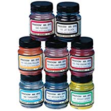
Tie Dye Colors Available at Amazon
Their main doctrine revolved around love, peace, and freedom of self-expression, Hippies believed that there was more to life than what the norms state. This is why they opposed restrictions above all else. And in the spirit of opposition, they, in turn, promoted what the society is opposed to and what was dominant in the world. Examples of what they advocated were the liberal use of what they called “psychedelic drugs” and freedom of sexual expression as well.
They also rallied for the environment, and most hippies were vegetarian. As an entire culture, they also had their own ways of expressing themselves through music and art. They maximized the use of these cultural tools in expressing what they believed in. Since they are also pro-peace, they do not engage in violence in demonstrating their views. Instead, they used other ways to be radical and make their mark, and be heard.
Two of the well-known forms of expression that the hippies used were music and their clothing style. The hippie music, which revolved mostly around “psychedelic rock” was one of the most popular ways these hippies lured people into their radical society. Their music also became popular.
Tie Dye Colors and Clothes
Their clothing styles and the way they carried themselves, however, were more radical than their music. The hippies kept their hair long, regardless of gender. In breaking societal norms, they also chose to forego some of what people usually regard as necessities. Some hippies go braless and some go barefoot. They liked to use bright, bold colors to express freedom. They showed their independence through the unhindered use of colors and unusual clothes.
The hippies were the advocates of the bell-bottom pants, long flowing skirts, and peasant blouses. Another clothing trend that claimed popularity, not only during their time but up to the present as well, are the tie-dyed t-shirts they used. To avoid supporting the corporate society, hippies liked designing and making their own clothes. The same is true with the tie-dyed theme. Tie-dyed shirts can easily be made at home, and they always come out differently every time. The colors would mix differently, and the patterns would be unique for each shirt.
As society embraced the other hippie trends such as bell-bottom pants, long skirts, and peasant blouses, the tie-dyed shirts still stand out as truly hippie. It is still, up until now, closely associated with being a hippie. Tie-dye shirts still remain a distinct symbol of being part of the hippie counterculture.
However, no matter how commercialized the hippie fashion statement may get, in truth, it is still closely linked with hippie values.
Tie Dye Patterns: How to Create 6 Different Design Patterns
TieDyeInstructionsManual.com a participant in the Amazon Services LLC Associates Program, an affiliate advertising program designed to provide a means for sites to earn advertising fees by advertising and linking to Amazon.com,
Links on this tie dye colors page are sponsored affiliate links and the owner makes commission if you buy after clicking these links. The owner is not a bona-fide user of this product. However, he has thoroughly researched tie dye colors and provided a personal opinion only. This disclosure is in accordance with the Federal Trade Commission’s 16 CFR, Part 255: “Guides Concerning the Use of Endorsements and Testimonials in Advertising.”